Choosing a book cover is so important. As a reader I will shy away from tacky-looking covers or covers that suggest to my subconscious that the book is a bit too girly or paranormal or whatever for my tastes. A glance is all it takes to put me off a book.
The trouble is, a cover that might put me off might at the same time attract others to at least read the book’s blurb.
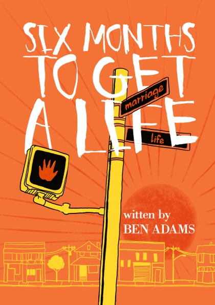
I have just received the attached two cover designs for my first book, ‘Six Months to Get a Life’. I would love to know what you think of them.

I wait with baited breath!
Ben

It was actually the orange cover that attracted me to this post, and to your blog for the first time! So that’s a good sign, right?
I think both are good options – quirky, eye-catching and intriguing – but to me they seem to be targeting different audiences. At first glance I’d think that the first orange cover could be young adult, or contemporary adult fiction with a humorous edge (Ben Elton and Nick Hornby for example), whereas the second cover looks edgier and less mainstream. I do think the second one is definitely more unique and less like something I’ve seen before if that helps.
I guess the big question is – what genre and audience are you aiming for? Either way, I’d look forward to finding out based on the covers alone.
The second cover is more eye-catching. I like how uncluttered it is compared to the orange cover. Good luck with the big decision!
While the first is more stylized, the second is more intriguing and quirky. I want to know about this guy. I wonder if there isn’t a way to blend the two a bit without losing the best of both. Good luck!
I would be more inclined to pick up the orange cover, if I’m completely honest (: Good luck with whichever you choose, though!
Thanks for your really helpful comments on this post.
Carlywrites, I am still trying to get my head around genres but the book is pretty much contemporary fiction. I wouldn’t claim to be half as entertaining as the likes of Ben Elton and Nick Hornby but I am certainly after the audience that read their books!
The challenge with the cover is to make it attractive to men and women alike. This challenge is obviously further complicated by the fact that not all men or not all women like the same things.
I am absolutely not a graphic design expert but I know what is attractive to me. I think I am with you Katherinej1012 in favouring the orange one.
Redbrickreads and Samulraney, you are right, the red one is eye-catching and more uncluttered. My publishers prefer that one to the orange one. It is quirky but does quirky sell? I am not sure I would pick up a book with a topless, fat uncool-looking bloke on the cover! Even in these days of e-readers, I am not sure I would download the book having seen that thumbnail image.
I also canvassed my mates at the cricket and even showed the two covers to people on the tube on my journey home from work last night. Some people said they wouldn’t pick up a book with either cover but those that expressed a preference mostly favoured the orange one.
I am going to keep talking to people and will keep you posted. Thanks again for your interest.
I liked the orange cover better. The street signs make me think that you’re trying to get your life in order in six months. Or else? Or maybe Or else!
The red one makes me think it’s a weight-loss book. That was the first thing that popped into my mind.
Is the book just about getting married? If not, can your art folks add an additional street sign to the post with another aspect of the book so that readers get a “Keyword Listing” of the book by just looking at the cover?
Top one
Orange cover with the street signs.
Definitely the orange cover. And your name is hard to read in the other one that is too gender specific. Btw thanks for blog follow.
I definitely prefer the first cover, Ben. Choosing a book cover is so important – I’ve recently received twelve thumbnails for the cover of my short story collection and I spent ages deciding. It’s worth taking your time and getting it right.
I like the first book cover with the signs. That is definitely the best one. Eye catching and makes the point. That is the one that I would reach for in the book shop.
Belated thanks to everyone who has commented here. Based on your comments, and those of others, I am going with a version of the orange cover, albeit with a couple of minor alterations. When I get it back from the designer, I will stick it up here for all to see.
Ben
I was just going to scream no1! no1!!! Great looking cover. good luck!
They both have their merits, but I vote orange.
For whatever it’s worth, I like the orange one best. xoxo 🙂
The 1st one. The 2nd one makes me wonder if the guy just ate something that make his belly feel funny 🙂